Commuting times from London railway terminals
Visualizing rail travel times from the centre of London to surrounding stations with the use of Python, SQLite and the folium package.
Recently, I took a train from Waterloo station to Woking to play a round of golf in Surrey. I’ve taken this route before, and Woking is a relatively easy place to get to because of the abundance of fast trains departing from Waterloo.
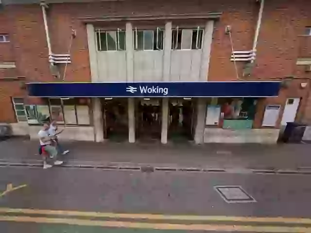 Woking: a superstar of the London commuting scene.
Picture credit: Kennedy News and Media.
No doubt this makes Woking a hotbed for London commuters looking to escape the inflated house prices in the capital. But how does Woking’s train service compare with other London satellite towns?
A Project for Python
I calculated and visualized the travel times to each station in London and the surrounding area using the following steps in Python:
- Download free timetable and station data in JSON format from Network Rail.
- Create relational tables for schedules and TIPLOCs (railway codes) in SQLite.
- Filter for trains departing from one of the 13 London terminals: Blackfriars, Cannon Street, Charing Cross, Euston, Fenchurch Street, King’s Cross, Liverpool Street, London Bridge, Marylebone, Paddington, St. Pancras, Victoria or Waterloo.
- Calculate the mean expected time from a traveller’s arrival at one of the terminals to reaching their destination.
- Visualize the time to each station on a map using the folium library, with green representing a shorter time and red a longer time.
Here is the map:
How was this calculated?
Let me expand a little more on the calculation of the times. I wanted a fair way to capture both the frequency and the speed of each train service.
Suppose you arrive at a London terminal at a random time on a Tuesday between 5:00pm and 7:00pm - typical for someone returning from a day’s work or shopping. You board the next available train with the earliest arrival time at your destination. For example, let’s say I arrived at Waterloo at 5:35pm and the next train to Woking was at 5:40pm. If the train then took 24 minutes to reach Woking (6:04pm arrival) my total elapsed time is 29 minutes.
I calculated this for each of the 120 minutes (i.e. one simulation per minute) from 5:00pm to 7:00pm and averaged them to get the expected time to each destination.
Observations
It goes without saying, the general trend is for stations close to the centre of London to have shorter journey times. If you live in Bethnal Green, you’re in luck - it’s less than 10 minutes from Liverpool Street.
Of course, Bethnal Green is hardly cheap nowadays. The more interesting stations are those further outside London which nonetheless have reasonable expected arrival times. Woking, to the south west of London for those unfamiliar with the home counties, stands out as one of the few solid green dots outside the M25 ringroad.
Moving clockwise around the outside of the M25, we see similar green dots at Reading, St. Albans, Harpenden, Cheshunt, Broxbourne, Shenfield, Ebbsfleet and Sevenoaks. All these towns have an expected arrival time of less than 33 minutes from arriving at the original station, and might be attractive options for people working in London but looking for more affordable housing.
Some considerations:
- I’m sure the train service to these towns is no secret, and house prices will be higher as a result.
- Train ticket prices may be higher as you go further outside London.
- London Underground stations could be added for a more complete picture.
I may revisit this analysis in future to incorporate house prices, travel cost, and tube stops. Nonetheless, I think it’s an interesting and useful visualization. I hope you agree! If you want to take a closer look at the code I used for this project, please check out my GitHub repo.
I welcome feedback! Feel free to contact me at knightjohn2@gmail.com.
© 2025 John Knight. All rights reserved.